SLDS-Modal Componen (Custom SLDS-UI Angular Module)
In this article I will continue to develop Task CRUD related logic. Last time (https://angular-python-salesforce.blogspot.com/2020/04/tasks-ui.html) we created List and Details view components for Tasks. This time let's create modal for new Task. But this time it should be a little bit complex solution - I want to start with reusable UI components. I will create Modal and Input components based on SLDS (https://www.lightningdesignsystem.com/) we use in our project.
First we need to create separate Angular module to join all UI elements we plan to create.

Now let's prepare our slds-modal UI component with my favourite feature - content projection.
slds-modal.component.html
First we need to create separate Angular module to join all UI elements we plan to create.
cd ./frontent
ng g m slds-ui
cd ./src/app/slds-ui/
ng g c slds-input --module=slds-ui.module.ts --prefix="" --export=true
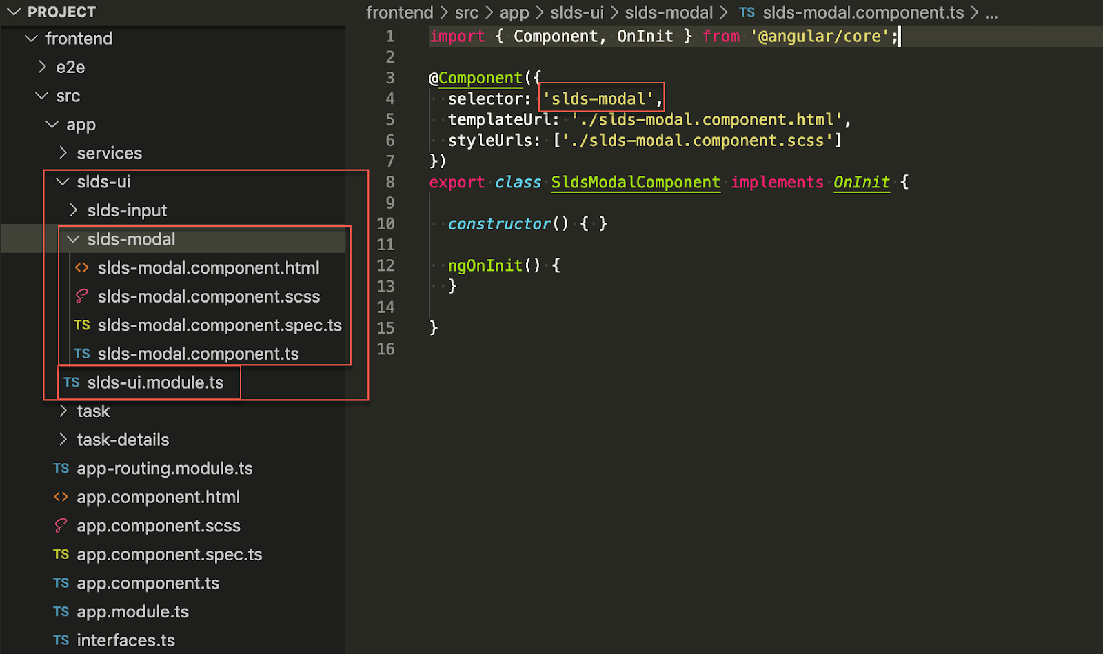
If all works fine you should see this folders structure. "--prefix" here disables default "app-" prefix that angular append to all new components, so you can see "selector: 'slds-modal'"
One more small hack to prevent tslint warning due to missing default prefix you need to update two lines in tslint.json

Now let's prepare our slds-modal UI component with my favourite feature - content projection.
slds-modal.component.html
<div>
    <section role="dialog" tabindex="-1" class="slds-modal slds-fade-in-open">
    <div class="slds-modal__container" [style.width]="width" [style.max-width]="width">
        <header class="slds-modal__header">
            <button class="slds-button slds-button_icon slds-modal__close slds-button_icon-inverse" title="Close">
                <svg class="slds-button__icon slds-button__icon_large" aria-hidden="true">
                <use xlink:href="/assets/icons/utility-sprite/svg/symbols.svg#close"></use>
                </svg>
                <span class="slds-assistive-text">Close</span>
            </button>
            <h2 id="modal-heading-01" class="slds-modal__title slds-hyphenate">{{title}}</h2>
        </header>
        <div class="slds-modal__content slds-p-around_medium" id="modal-content-id-1">
            <ng-content select="modal-content"></ng-content>
        </div>
        <div class="slds-modal__footer">
            <ng-content select="modal-actions"></ng-content>
        </div>
    </div>
    </section>
    <div class="slds-backdrop slds-backdrop_open"></div>
</div>slds-modal.component.ts
import { Component, OnInit, Input } from '@angular/core';

@Component({
    selector: 'slds-modal',
    templateUrl: './slds-modal.component.html',
    styleUrls: ['./slds-modal.component.scss']
})
export class SldsModalComponent implements OnInit {

    @Input()
    title = '<No modal title>';
    @Input()
    width = '50%';

    constructor() { }

    ngOnInit() {
    }

}
and slds-modal usage example
<slds-modal
    *ngIf="showNewTaskModal"
    title="New Task">
    <modal-content>
        <p>Lorem ipsum dolor sit amet, consectetur adipiscing elit. Aenean porta libero a elit elementum, at lacinia purus tincidunt. Sed interdum, orci non tempor placerat, dolor nulla fringilla dolor, nec tincidunt velit felis porttitor massa. Maecenas arcu nulla, ullamcorper ac mauris id, ultricies porta leo. Interdum et malesuada fames ac ante ipsum primis in faucibus. In blandit vulputate orci vel iaculis. Donec nibh nisi, fringilla nec odio et, euismod vestibulum ipsum. Proin leo lectus, porta at mi in, mollis accumsan ex. Proin sit amet lectus non augue tempus commodo. Morbi lorem sapien, faucibus at feugiat eu, mattis eu lorem. Nulla non augue vel erat sollicitudin laoreet at et neque. Nulla in dolor sit amet justo sodales dignissim a vel justo. Etiam sed augue suscipit, hendrerit augue quis, ullamcorper justo. Curabitur vitae vulputate sem. Vestibulum ante ipsum primis in faucibus orci luctus et ultrices posuere cubilia Curae; Nullam suscipit malesuada lorem id condimentum.</p>
    </modal-content>
    <modal-actions>
        <button class="slds-button slds-button_neutral">Cancel</button>
        <button class="slds-button slds-button_brand">Save</button>
    </modal-actions>
</slds-modal>
To make our new UI module work and also to enforce Angular support custom tags for content projection you have to provide few additional update in app.module.ts

I'm ending this article with custom angular modal slds-ui and will continue with Task UI in the next post.


Comments
Post a Comment